Packaging
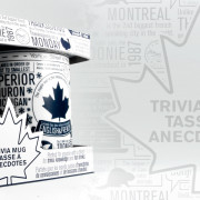
Feeling Canadian Eh?
This great Canadian Trivia Mug can be found at Mark’s Works Warehouse. Not only will it increase your knowledge of Canadian trivia but it’s a great conversation piece whether it’s at home or at the office. For this project the…
Read More.
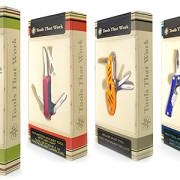
Packaging That Works!
Tools That Work consists of four tools with a sleek and modern design. We brought that out even further with a clean package design that uses simple lines and contrasts through color and background.
Read More.
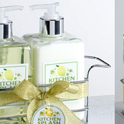
Kitchen Splash
Perma Brands, a distribution company, asked that we work with them to design labels for one of their clients products. They wanted something clean, refreshing, and modern looking. But it was important that the design would translate well on round,…
Read More.
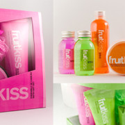
Fruitkiss
PermaBrands wanted us to come up with a fun and vibrant design for this product line. Using a bright palette of colors and very modern yet fun typography we managed to create something that really pops on screen and will…
Read More.
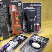
Dakota Tools
Perma Brands, a distribution company, asked that we work with them and one of their clients on taking the existing Dakota design and extending it throughout a number of new products. Not only did we do the layout for all…
Read More.
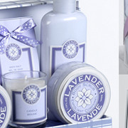
Lavendar
Perma Brands, a distribution company, asked that we work with them to design labels and packaging for one of their clients. The client simply asked that we use no images, keep the colors down to one, and that they liked…
Read More.
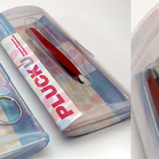
Pluck U
Asked to come up with a funky package design for a product pitch, IN Creative came up with something using fun colors and a simple, clean layout. The goal was to make the product pop and bring attention to the…
Read More.
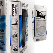
Razor Pit
When Perma Brands required a redesign of their RazorPit packaging, having done many previous projects for them, they knew we would get the job done right. The reason for the redesign was that the product was to now be sold…
Read More.
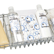
Spa Blue
Perma Brands, a long time client of IN Creative, asked that we work with them to create a fun and bubbly new design for one of their spa labels. Keeping the design down to a 2 color job and using…
Read More.
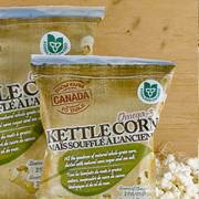
Farm To Table Popcorn Bags
Farm To Table wanted to design the packaging for their new line of Ontario Grown Popcorn. The feel of the design had to go with the feel of their brand which is bring the farm back home. The use of…
Read More.
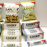
Lucky Packaging
Grand River Gourmet contacted us to design the packaging for their new line of chocolates and popcorn. With 3 amazing chocolate and popcorn flavors, the Lucky Star packaging had to really pop and stand out among the already existing sea…
Read More.
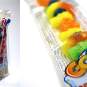
Goodie Stix Candy
Grand River Gourmet wanted to introduce a fun and tasty candy product to the general public. After years of going private label with Goodie Stix it was time to give their own identity to their packaging. With the use of…
Read More.
